We’re featured on DESIGNRUSH this month. Go check it out here:
https://www.designrush.com/best-designs/packaging

We’re featured on DESIGNRUSH this month. Go check it out here:
https://www.designrush.com/best-designs/packaging

This one is for the Morris Museum in New Jersey.
As a New Jersey native, lifelong artist, and professional graphic designer, I’m a bit embarrassed that I only recently discovered the Morris Museum. Museums hold a special place in my heart, and this one is no exception. The level of care, intention, and sense of community they foster is truly inspiring.
That inspiration led me to explore how their visual identity could evolve to reflect the museum’s dynamic and engaging spirit. I wanted to ensure their identity was as unique as their space and truly ownable. Letting the incredible work they exhibit take the lead made the most sense, so I kept the color palette strictly black and white to avoid competing with the artists' stunning creations. The nontraditional solution for the double-M logomark adds visual interest and stands as a work of art on its own.
If anyone has a contact at the Morris Museum who can help me get this in front of the right people, let me know!
- Cody
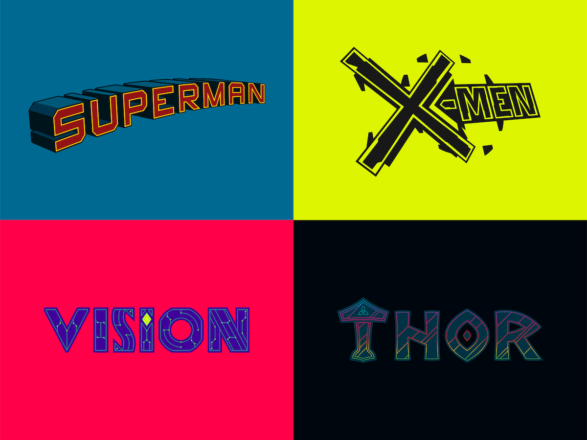
I have never been a fan of parody design. It is often a lazy, uninspired, and ham-fisted crutch used by bad designers, pandering to tasteless audiences. The two elements being parodied rarely ever have a shred of connective tissue, and it is nothing more than a shortcut used by the uninitiated in an attempt to seem interesting. It's almost never the answer to the question, “What should this design be?”
THAT BEING SAID, I made a whole bunch of parody designs! I was tasked with creating some merch for a YouTube channel that specializes in content focused on comic book and genre movies. Since they don't have licensing agreements with the studios, this is actually the perfect use case for parody design. How do you allude to these properties without just putting a big red and yellow 'S' on a T-shirt? Don’t want to get sued? Parody design to the rescue!
This was a great opportunity for me to put my money where my mouth is and see if I can deliver where I feel so many fall short. I had one simple rule for myself: DON'T FORCE IT. If it fits, it fits. If it doesn't, don't try to shoehorn two elements together for no reason. Look for logical and/or organic connections. I found that the key to my success was the tagline – that much-needed special sauce. The all-important third element that connects the first two and makes it all make sense! The result was a wide variety of different types of parody designs: some brand parodies, some design style parodies, some wordplay, and even some parallel pop culture parodies. A pretty inspired bunch, if I do say so myself.
Also, the company didn’t end up using any of them, so they are all for sale!
- Cody

Today's ON SPEC entry is just for fun.
I don't know about you, but if I ever hear an interesting phrase, name, or grouping of words that I like, I file it away for later use. "This is something" I say to myself and I let it live in the back of my mind until "what it is" finally reveals itself. Is it a company, a product, or, like most of them, is it the name of my next hypothetical band?
Unlike last weeks post of hypothetical work for real bands, this weeks post is a collection of hypothetical work for hypothetical bands. Whether it's the funk outfit The New Moody, with pockets so deep you'll lose your keys, the indie darlings Neutered Sprite or the post-punk noise rock of Raygun, there is something for everyone on this make-believe triple bill.
While some of these interesting idioms are destined to live out their lives as my next fake band, sometimes this is just an amusing way station for their final incarnation. Who knows, maybe one day you'll be buying New Moody aromatherapy candles at Target or learning about your new favorite rock band in RAYGUN Magazine (jk David Carson)... but at least now they will also have a life on LinkedIn, where talented people, desperate for work, scream into the void.
The call to action for these posts is normally to activate my LinkedIn network to help me get in contact with the companies that I do speculative design work for, in hopes to potentially work with them but in this case, does anyone want to join my band? I currently have 3 of them.
See you in the next one.
- Cody


This is a fun one. While I will always be an artist and designer, I have not-so-secretly always wanted to be a rockstar. The only thing standing in my way is a lack of musical talent. My chosen career path does, however, afford me the opportunity to occasionally be part of industries that I love dearly, like fashion, skateboarding, and MUSIC. It makes sense that I would also design in this space even when I’m not getting paid for it (yet).
This collection of works includes type treatments and merchandising for Biffy Clyro, The Allman Brothers Band, and Thin Lizzy. Since the latter two bands are no longer active, it makes contacting their representation a bit more difficult. They do still release music and merchandise, though, so all hope is not lost. I have reached out where I could, but have not heard anything back. Biffy is still melting faces, so their representation is a bit easier to track down, but alas, still no response. If anyone has any info on where to look or who to reach out to for any of these bands, please let me know. It would be an honor to have even the smallest impact on the legacy of these artists that mean so much to me.
These designs are all about honoring the ethos of the band while bringing as much of myself to it as possible. I wouldn’t touch these artists if I didn’t think I had something to add to the conversation. In this case, what I think I offer is a bit of focus and intention to their already established legacies and aesthetics.
While the ship has certainly sailed on my career as a rockstar, I think there is definitely a place for me to have an effect on an industry that has had such a profound effect on me. If you can help make that happen by pointing the right people in my direction or helping to illuminate my path, that would be greatly appreciated. New year, new opportunities! Thanks for tuning in!
See you in the next one.
- Cody


Today’s entry for ON SPEC is an interesting one. It’s for another one of my favorite YouTube content creators, New Rockstars. New Rockstars is a YouTube channel, led by Erik Voss, that analyzes movies and TV, uncovering Easter eggs and hidden details in popular culture, with a focus on Marvel, DC, Star Wars, and more.
This project started much like the rest of them. I had been a fan of New Rockstars for years but always thought that their branding could use an upgrade. So, I worked up a rebrand and reached out to them to see if they were interested in using it. And they responded! However, their response was to tell me that they were actually already in the process of rebranding with a different designer. 😞 Now, I could’ve beaten myself up about this and thought, “Why didn’t I act faster?” or “Why didn’t I do this sooner?” But that wouldn’t have been useful. I’m happy I did it at all. It was a creative exercise. It yielded great work. And hey, it almost worked! I got a response. That’s progress. They also said that they would keep my info in case the current rebrand goes south or if they need design support in the future. Connection made!
As for the design, the one bit I wanted to try and preserve from their existing branding was their NR monogram with a lightning bolt in the middle. I’m not sure where this came from, but they are a huge channel with, I’m sure, at least some brand recognition, and who doesn’t love a lightning bolt. They have also been expanding into multiple channels, so I wanted to make sure to build a system that could be extrapolated to fit all of them while keeping a cohesive visual language. Something their current system lacks. Above all, I wanted to make sure it was FUN! They create content revolving around any and all genre media and have a BLAST while doing it. So the last thing this identity could be was boring or take itself too seriously. There are vintage ringer tees that look like they were taken right from the closet of the next pinball wizard, pom-pom beanies, and all-over print pajamas so can rep NERD culture in any season and at any time of day. Gone is the generic, probably Gotham, font and clipart lightning bolt, and here is the bold, bright, and OWNABLE new monogram. Their once unremarkable “reddish” brand color gets a luminance boost and now shares the stage with ELECTRIC YELLOW to create an identity bursting with energy.
Even though I have already received a less than ideal response from New Rockstars, the journey with this project isn’t over. My #1 hope is that they finally get the identity they deserve, and in the chance that their current rebranding doesn’t go the way they’d hoped, I am now first on their list of candidates to make it happen for them. And if not, I get to see how my work stacks up to the identity they ultimately go with. This one was a blast. I hope everyone likes it as much as I do!
See you in the next one.
- Cody
Today’s entry into my ongoing series, ON SPEC, actually originated from a (unsuccessful) job application. After applying for an open designer position at this company, I was excited by the prospect of working there and I immediately had an idea for how to enhance their branding. Despite their eventual rejection of my application, within the two days it took for them to respond, I had already developed an entire rebrand and decided to share it with them anyway.
Critical Role, founded by a group of talented voice actors, including Matthew Mercer and Laura Bailey, is a renowned entertainment company. Best known for their flagship show on Twitch and YouTube, the team embarks on epic Dungeons & Dragons campaigns with high production values and captivating storytelling. Beyond the main campaign, they explore various tabletop role-playing games, host talk shows, and interact with a dedicated fanbase known as "Critters." Critical Role has expanded into publishing, merchandise, and live events, including a recent SOLD OUT show at Wembley Arena, solidifying its status as a trailblazer in the TTRPG community with a global impact.
The current branding for Critical Role heavily draws from the visual language of D&D but lacks a unique identity and ownability. I aimed to provide them with something that felt familiar yet entirely their own. I retained the recognizable hexagon shape, echoing the silhouette of the twenty-sided die ubiquitous in TTRPGs, and repurposed it as the container for the CR monogram as well as for image frames and a repeating pattern. A new, brighter color palette breathes life into what can often be mostly dark and dour, middle-earthen tones. A completely custom wordmark, again borrowing from a familiar visual language without appearing as pastiche, further cements the identity as singular. The niche that Critical Role occupies also afforded me the opportunity to create unique pieces, such as custom character trading cards and branded dice caddies. I also wanted to rebrand some of their current instagram posts to show how the rebrand extrapolates across usage cases.
As I mentioned earlier, I have reached out to Critical Role to gauge their interest in this direction for their brand, possibly for their upcoming 10-year anniversary, but have yet to receive a response. If anyone out there knows the right person at Critical Role who needs to see this, please tag them, forward this to them, or send them my way! They are a great brand and deserve great branding.
'til next time.
- Cody


Today's ON SPEC entry is highlighting the Youtube channel Throttle House. Throttle House is a popular automotive YouTube channel known for its engaging and entertaining content, focusing on car reviews, comparisons, and performance testing.
I discovered Throttle House during the pandemic and was instantly hooked. Fortunately, I had a considerable backlog of videos to go through. I was drawn to the dynamic and charismatic hosts, Thomas and James. Their passion and knowledge for cars translate even to someone like myself, who, although loves cars, wouldn't consider myself a "car guy." They make a world as complicated as cars accessible to everyone, and their banter and friendly ribbing create a unique dynamic in a world as saturated as car-centric YouTube content. Their videos are also filmed beautifully and offer super high-resolution views of the awesome cars as well as drone-captured b-roll and action shots.
But, you guessed it, the branding for Throttle House doesn’t quite live up to all of these amazing things I just listed about the company. The automotive world has such a rich visual history, so I thought I would inject some of that DNA into the Throttle House brand by looking back to decades like the 1950s, 60s, and 70s. Vintage F1 and rally posters, checkered flags, Steve McQueen, Le Mans. All of these things evoke the romanticism of what it feels like to get behind the wheel of these beautiful machines and burn some rubber. For the logo, the T and H letterforms combine to form a (figurative) representation of a classic manual gearbox. As for the brand color, for some reason, no color conjures the feeling of speed and power like red, so Rosso Corsa it is. (not literally since I’m sure that is copyrighted by Ferrari). I was also able to pull certain running jokes and bits from the videos like their pair of 80s tuners named Toe Foo and Schnitz and James’ incredibly unique catchphrase "…and I’m James." All of these pieces come together to form a visual identity that is singular to Throttle House.
I was able to send Throttle House a message through the contact portal of their website, but who knows where those messages really even go! If anyone has a more direct line of contact with them, please let me know. This identity was such a rich sandbox to get to play in, and I’d love for it to be used in an official capacity so I may have the chance to play some more.
Thanks and see you for the next one!
- Cody

Ok, so my next entry in ON SPEC is definitely going to earn me a cease and desist, but hey, any press is good press, right?!
I have been a comic book fan my whole life. Superheroes were the first things that made me want to make art and I never looked back. Artists like Tradd Moore, Alex Ross, Greg Capullo and Sean Gordon Murphy are some of my all-time favorite artists, regardless of medium, and huge inspirations to me. I was always blown away by the craft and care given to comic books, even though many snobs have considered them not “real art.” I have noticed, however, that the same care given to the artwork is rarely given to the title treatments and often dilutes the beautiful work of the pencillers, inkers and colorists.
In my search to find contact information for any relevant departments at DC Comics & Marvel Entertainment I have continually come up empty-handed. Maybe that is telling, and the truth is, these companies don’t have dedicated type designers handling the title treatments and it often falls on an artist who mainly specializes in figurative art? Or maybe I am speaking completely out of school. That's always a strong possibility with me.
Either way, once again this has led me to insert myself where no one asked and try to give comic book title treatments the attention they deserve. Taking extra care to create well-crafted letterforms, balanced layouts and thoughtful concepts that often build on existing well-known title treatments that have "good bones" but just need a bit more refinement and intention. I am attempting to create covers for each to give the titles context but I seem to come up with new title ideas faster than I can illustrate covers. Hopefully I'll eventually catch up to myself. This is an ongoing passion project that gets added to whenever inspiration for a new title strikes.
If anyone has a contact at either Marvel or DC, let me know, or point them in this direction. This one is a Hail Mary, I know, but the little kid in me, drawing Spider-Man pictures on his bedroom floor, can dream of one day, seeing his type designs on the covers of his favorite comics.
P.S. - Hopefully this series isn’t coming off as negative or judgmental towards the involved companies and artists. I am, in no way, trying to demean or disregard the efforts of honest, hardworking creatives. I am one of you. This is all out of love.
- Cody


Up next in my ON SPEC series is Kott Motorcycles. Owned and operated by Dustin Kott, Kott Motorcycles specialize in the fabrication and design of vintage motorcycles. Dustin creates some of the most beautiful bikes in the world, and you don't have to take my word for it since he's even built one for Ryan Reynolds!
I fell in love with Dustin's bikes a decade ago and again, like every other entry in this series, took it upon myself to give his brand the upgrade I thought it deserved, in the form of a new visual identity. There are many things that are very classic "moto brand" with the upgrade but I wanted to make sure that each of Dustin's unique bikes could have a Kott logo on the tank that is inline with that bikes vision, so I designed nearly 20 different expressions of the Kott wordmark to show the names visual versatility. Any of these designs would also be right at home on an oil stained t-shirt, a leather jacket or any number of other merch items, proving there is quite a bit of mileage in each design... (see what I did there? Mileage... 😬)
I reached out to Dustin many years ago when I initially did this work and he actually responded and sounded interested in making something happen. Unfortunately, communication waned and nothing ever came of it. I still send Dustin an annual email with the same request, "Lets make great things together!" but to no avail. Either way, I am still extremely proud of this work and think it deserves to be seen.
So Dustin, if you happen to see this, "Lets make great things together!" Also, if anyone happens to have Ryan Reynolds number maybe I could reach Dustin through him. 🤷♂️
P.S. - Dustin, I am also willing to accept a motorcycle in exchange for the rebrand... 🏍
- Cody
This is the first entry into a series I am calling ON SPEC. In the last decade+ of being a designer, there have been instances where I notice that an awesome brand, may have a less-than-awesome visual identity.
This usually sparks an idea in me of what that identity could and/or should be. So, I take it upon myself to create said identity, on spec. I let the creative juices flow and try to do the company justice and worry about the logistics later.
If, when I'm done with the identity, I can get in contact with the company and we can work something out, great. If not, I still have a beautiful Identity system that I am proud of and deserves to be seen.
Today's entry is for a company that, as a New Jerseyan, is very near and dear to me. Taylor Pork Roll, or as people from my neck of the woods call it, Taylor Ham, is a delightful little breakfast meat that rivals even the best bacon (as far as us New Jerseyans are concerned). If you are from New Jersey (or even parts of Pennsylvania) there is a good chance you were raised on the delectable delicacy and will recognize this rebrand from its bright red pop of color and the notched circle shape of the Taylor Ham that lets you know a delicious breakfast sandwich is right around the corner. Italian Deli's are also a ubiquitous part of living in New Jersey so I would be remiss if I didn't include them on the marketing.
Now is where you come in! This series is not only to spotlight some of my favorite work, but also to use this community to put the APB out and try and track down the people at these companies that need to see these designs in hopes that they could possibly adopt them.
Taylor is a company that is over 160 years old and has almost zero public presence. I have looked everywhere and have found no way of contacting them. If anyone knows something that I do not, please, let me know.
Thanks, and be on the lookout for the next entry in ON SPEC!
- Cody


